Vail Spa Condominiums
Website redesign for a luxury ski-in condominium property in Lionshead Village, Colorado.
My Role: UX/UI Designer
Scope: Homepage, inner pages, design system Platform: Desktop & mobile

Project overview
Context and Project Goals: Vail Spa Condominiums is a ski-in luxury property in Lionshead Village, Colorado. Its existing site still carried the visual identity of a former management company — a light blue and brown palette the new team wanted to leave behind entirely. The goal was a homepage and set of core inner pages that read as premium and current, while staying realistic about what the client could actually supply: a modest photo library and copy that was still being finalized.
My Role and Contribution: I worked as the UX/UI designer on the project end to end — from reading the client's design thought document and reference sites, through three rounds of homepage concepts, to a documented design system and dev-ready handoff for the homepage and two inner pages: The Property and Explore Vail.
Work process
Research and Analysis: Rather than a tight brand brief, I started with a design thought document: a short list of starter brand colors, and eleven competitor and inspiration sites with line-by-line notes on what the client liked and didn't. That kind of input is a gift and a trap — it's rich signal, but it's also eleven different opinions pointing in eleven different directions.
I read it less as a spec and more as a set of tensions to resolve: the client wanted a persistent, always-visible booking bar instead of one buried in the footer; a prominent "Book Now" action instead of a login link that only confused first-time visitors; and — repeatedly — praise for one reference site's calm, full-bleed photography and restrained navigation over busier, denser competitors. That reference became my north star for pacing and whitespace, without becoming a template to trace.
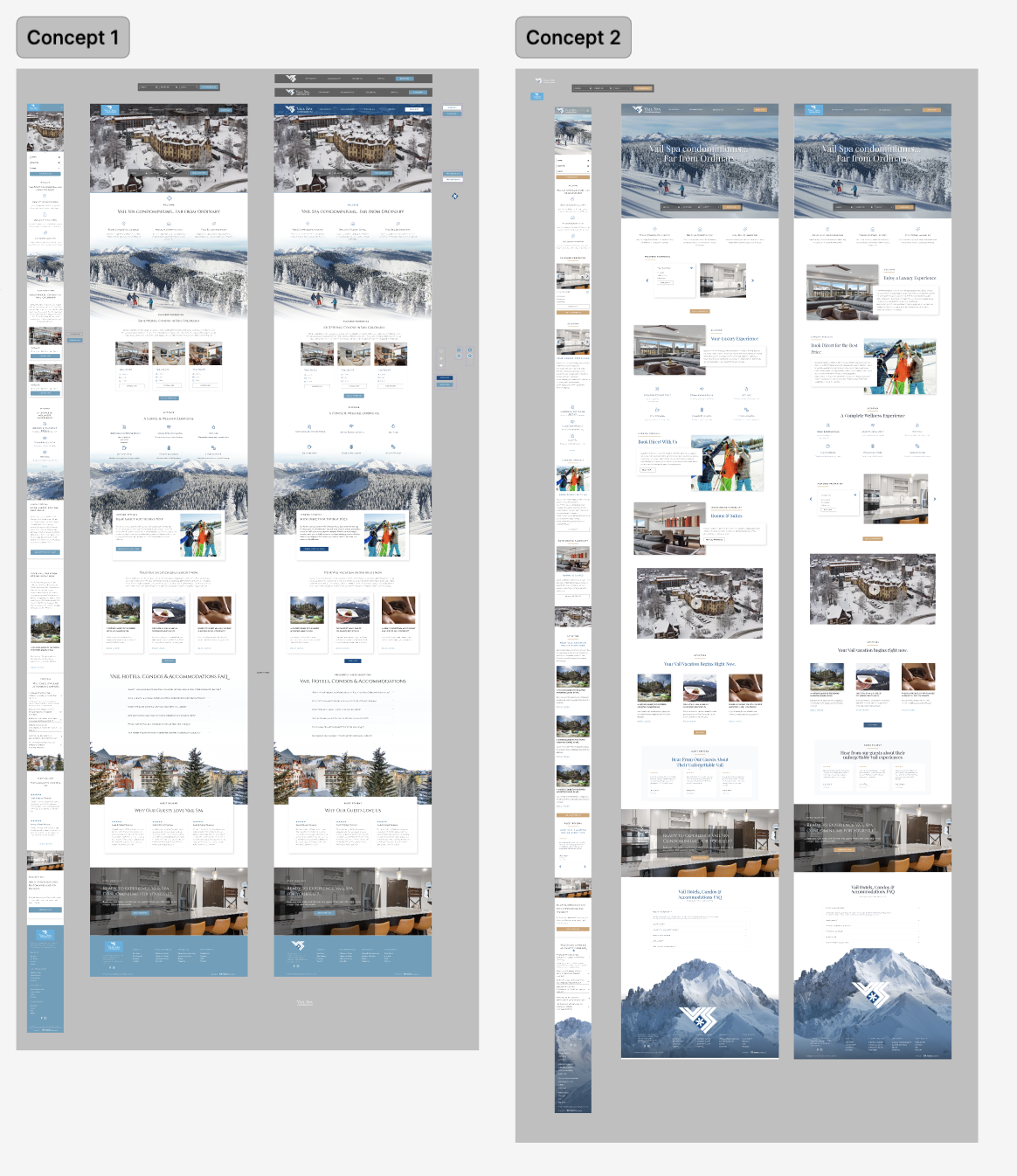
Ideation and Concepts: The first homepage concept leaned into the client's stated preference for a borderless, uncluttered layout. The second round expanded on it once it became clear how much content the client actually wanted represented on the page — accommodations, amenities, guest services, local activities — while keeping the calm, editorial pacing from round one intact rather than letting the added content crowd the page.
Responsive Design: The homepage's editorial pacing — generous whitespace, one idea per section — had to hold up on a much narrower canvas. Rather than compress every desktop section proportionally, I re-prioritized: the booking search moves to the top of the mobile scroll (it was the most-requested action in the client's feedback), and lower-priority content like guest reviews sits further down the page. Typography, spacing, and the accommodation cards were rebuilt as their own mobile-specific components, rather than scaled-down copies of the desktop versions.
Homepage
A floating booking bar over a light hero, accommodation cards sized for the client's actual unit mix, the wellness/video feature, the Book Direct module, guest reviews, and the mountain photograph closing the page in the footer.
Desktop
"A Complete Wellness Experience" pairing a full-width video placeholder with a short editorial introduction.
"Book Direct With Us" — the content-gap module
Guest reviews, kept quiet and text-led

Mobile

“The Property” page
The inner page carrying the heaviest information load: condo layouts, in-unit features, building amenities, and concierge services. The priority here was scannability — guests comparing unit types needed to find bedroom count, views, and included amenities without reading dense paragraphs.
Desktop
Page intro — location and access, stated up front
Scannable unit-type cards showing bedroom count, layout summary, and photograph for one unit type.
Building amenities, as a photo grid

Mobile

“Explore Vail” page
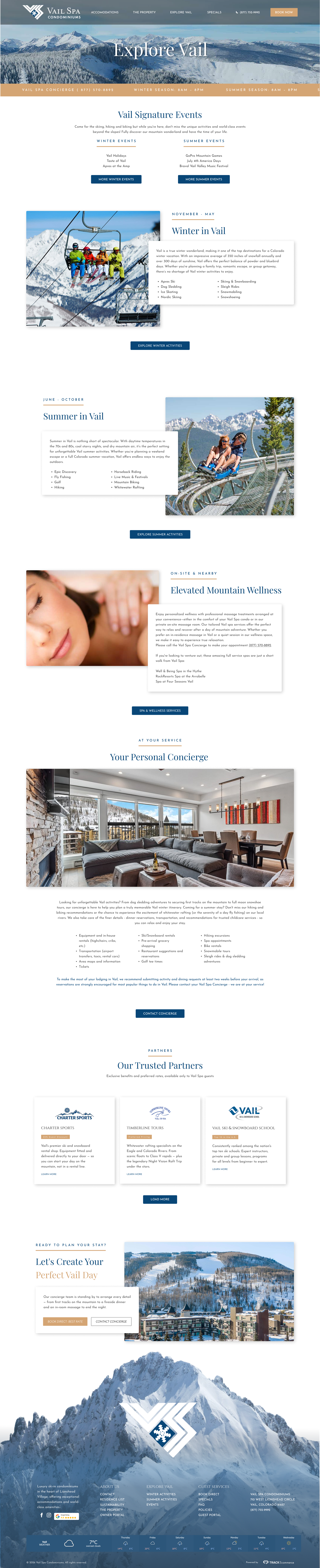
A page built to do double duty as a concierge tool: a seasonal calendar of local events, activity categories for winter and summer, and a partner-discounts section, closing on a direct line to the concierge team rather than a generic contact form.
Desktop
Seasonal events calendar
Activity categories, split by season
Partner discounts and concierge contact, closing the page
Mobile

Design System
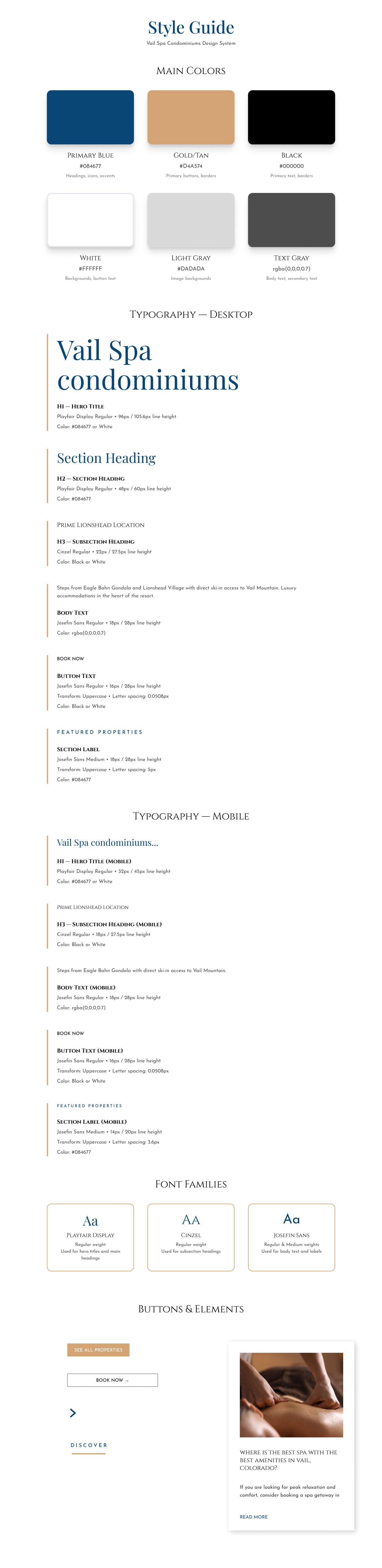
Once the homepage direction was approved, I documented it as a standalone system — color tokens, a type scale for desktop and mobile, and core components — so the palette and pairing decisions above could be applied consistently across every future page, not just the ones I designed myself.
Color tokens, documented in the Figma design system
Vail Spa Condominiums design system documentation showing the primary blue, gold-tan, black, white, and gray color tokens with usage labels, as built in Figma.
Type scale, desktop and mobile
Vail Spa Condominiums design system typography scale showing headings, subheadings, and body and label text at desktop and mobile sizes.
Challenges and solutions
| Challenge | Solution |
|---|---|
| The client's starter colors leaned toward a soft periwinkle-lilac — pleasant, but closer to a spring resort than a winter mountain property. At the same time, they'd said they were open to suggestions, which meant I needed to propose a real alternative rather than default to what they'd specified. | I built the working palette around a deeper ink-navy instead, reserving the client's original tones as a labeled comparison so the shift was a visible, explainable choice rather than a quiet substitution. We reviewed both palettes side by side in a design check-in and agreed the navy direction better matched the alpine mood and gave stronger text contrast on photography. It became the primary brand color carried through headings, icons, and accents in the final system. |
| My first pass used a dramatic mountain photograph as the hero, fading into a mostly-white page below — dramatic, but it front-loaded all the visual impact and left the rest of the page feeling flat by comparison. | In review, we agreed the image actually worked harder as a closing note than an opener. Moving it to the footer let the rest of the homepage stay light and editorial, true to the client's stated preference for a white, uncluttered canvas, and gave the page a satisfying visual "exhale" at the end instead of spending all its drama in the first scroll. |
| The client's copy and photo library were thinner than the homepage needed. Stretching the existing content to fill the space would have made the page feel padded and unfinished. | I designed a dedicated "Book Direct With Us" module — a focused best-rate call to action that gave the page a natural, useful section rather than a padded one, and quietly reinforced why guests should book directly instead of through a third party. |
Results and takeaways
The homepage, The Property, and Explore Vail moved into development as documented in this case study, backed by a standalone design system so future pages can stay on-brand without me in the room.
The proposed navy-and-gold direction replaced the brief's starter colors after a side-by-side review — a reminder that a design thought document is a starting point for a conversation, not a final spec. Layout decisions throughout the project accounted for the client's actual photo and copy inventory rather than assuming a fuller content set than they had, which kept the page honest instead of padded.
Documenting the palette, type scale, and core components as a standalone design system — rather than leaving them implicit in three page designs — means the site can grow past its initial three pages consistently, without requiring me to be in the room for every future addition.
Thank you!
Thank you for taking the time to explore this case study. If you're looking for a designer who thinks through problems carefully and communicates decisions clearly, I'd love to connect:
oligachebot@gmail.com